View vulnerability rates
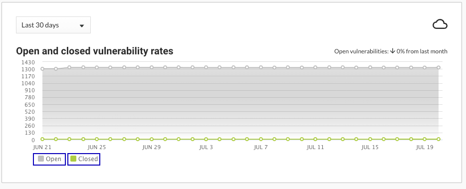
The chart for open and closed vulnerability rates shows trends for the vulnerabilities for all applications in your organization.
Steps
Display the new dashboard by selecting View your new dashboard.

In the new dashboard, find the chart for Open and closed vulnerability rates.
Select a time frame for the chart:
Last 7 days: Displays vulnerabilities rates for the seven days before the current date.
The chart shows data points for each day.
Last 30 days: Displays vulnerability rates for the 30 days before the current date.
The chart shows data points for each day.
Last 12 months: Displays vulnerability rates for the 12 months before the current date.
The chart shows data points for each month.
Custom: Displays vulnerability rates for a selected time frame.
The chart shows data points for each day, each week, or each month, depending on the selected time frame.
If no data exists for part of a selected time frame, the chart displays no data for that part of the time frame. For example, if you selected a time frame of the Last 12 months but started using Contrast only nine months ago, the chart displays no data for the first three months of the time frame.
To view the percentage of change during the selected time frame, look at the value at the top of the chart

To filter the chart to display only open or only closed vulnerabilities, select the keys at the bottom of the chart.
Select the keys again to clear your selection.
To view only open vulnerabilities, select the Closed key.
To view only closed vulnerabilities, select the Open key.
